Every few days there's an interesting article proposing new interfaces at UXmovement. It's like a serialized release of a new Tufte book, not always what you agree with, but invariably both thought-provoking and affirming.
I've broadly agreed with almost everything I've seen there in the past few weeks, including having a few "wow, yeah!" moments. So it's only when I think there's room for discussion that I'm blogging about it, and I hope that it doesn't come across as caviling! A recent post talks about simplifying the "search hotspot" on your websites by moving elements around. I like the ideas behind this simplification, but it would definitely need testing, especially as a lot of influential sites (including Amazon) moved in the other direction years ago.
The major problem I foresee is not so much ambiguity: the ambiguity is eventually resolved by the text on the button. It's more to do with how you optimize an interface for "just-in-time" disambiguation. People in the Western world largely read from left to right (although you could swap "left" and "right" in this blogpost and it wouldn't matter so much), so forcing people to look first at an empty box on the left, wonder what it is, continue right, then see the button, then---"aha! that box I just saw a half-second ago was a search text box!"---look back to the box in order to search... this complicated just-after-time disambiguation slows the user down, and makes them cumulatively uncertain using your site.
"Search" in a right-hand button disambiguates retroactively, whereas you'd ideally want the user to be disabused of any notions before they even get to the box. Accessibility points directly at the issue here, serving as the canary in the coal-mine. The way that the proposed alternatives don't meet accessibility guidelines---no labels for the text box or the dropdown---suggests that the only thing that ever truly disambiguates an input element is, ultimately, a label. And this label typically sits (or is read out by a screen reader) before the box, not after it.
The suggestions on the most recent UXmovement post are also not consistent with guidelines in a previous post about why users fill out forms faster with top-aligned labels. What do I mean by that? Well, in that post, very close label/input combinations in a clear single visual direction are treated as a single step; back-and-forth combinations comprise multiple steps.
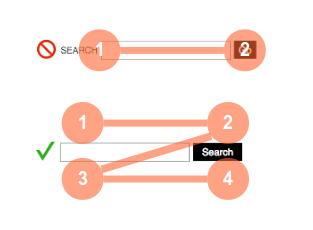
Just for fun, let's give two of UXmovement's suggestions their own treatment:

Here we see the behaviour I discuss above. In the first example, the eye travels from the search label/input (which it fills in) to the go button: two steps. In the second, the eye sees the input box; looks right for clarification; looks back to the beginning of the input field to fill it in; moves back to the search button to click it: four steps.
Does that really mean there's a problem here? Does consistency between different parts of a web interface matter? Well, I have to stress that, as with accessibility, inconsistency is not a deal-breaker for a new interface; but you have to be sure that the widely accepted "visual grammar of search" and plain observed user behaviour supports the contextual changes you make to your UX guidelines. The user is key. You want to keep them as happy and as certain as possible: they have to continue to trust their weight to your interface.
Who knows? You might find in usability testing that people are so used to the visual grammar of search---a box in the top-right means "search"---that you could get away with no button at all, and people would figure it out with a low failure rate.
Inconsistency is fine. Inaccessibility---when we're prototyping new user interfaces, and accessibility with slow-moving web standards is often post hoc however hard we try---is OK, but it needs to get sorted before production releases. And clutter is completely excusable, if that clutter makes every next step a no-brainer.
If the user needs clutter, provide clutter; if they don't, don't. Your user interface does not have to be a show home. It just has to work.

Comments
Anonymous (not verified)
Tue, 05/10/2010 - 21:21
Permalink
Confusing
I read the artical and found it quite intresting... though i could still not find the search box top right of your site ;)